The Art of choosing the right graph. Telling a story with your data
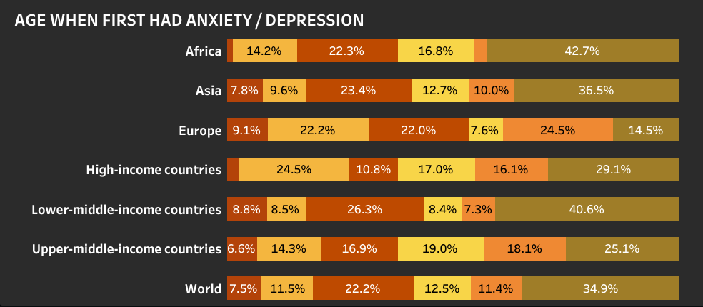
I still remember the first time I had to present data in a university class - my professor was there, along with a lot of my classmates. I had a beautifully detailed dataset, a thorough analysis, and what I thought was a well-prepared presentation. But when I put my charts on the screen, I could see the confusion on everyone's face. The number was there, but the story was lost. That was the moment I realized: choosing the right graph isn't just about visualising data - it's about making people understand it.
So, how do you transform raw data into a compelling visual story?
It all starts with choosing the right graph. Let's dive in!
Data visualisation is not just decoration - it's a crucial tool for communication. The right graph can highlight patterns, uncover insights, and make complex data digestible. What if we select the wrong graph? It can mislead, confuse, or obscure important trends.
By answering these questions, you can match your data to the most suitable visualization.
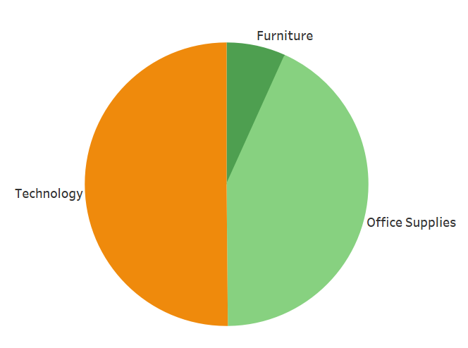
Pie chart overload
Using too many slices makes it unreadable. Stick to 5 or fewer categories.
Ignoring time trends
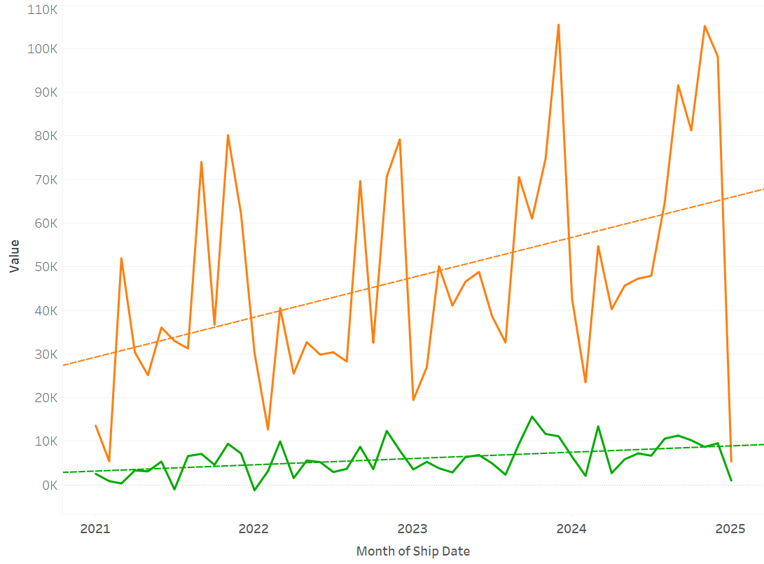
Bar charts are great for categories, but use a line chart for trends over time.
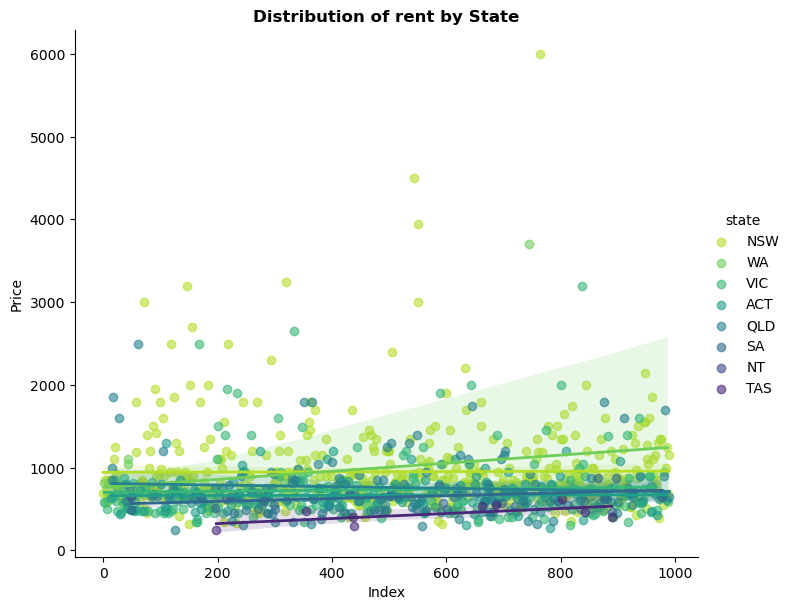
Overcrowded scatter plots
Too many points without clarity can obscure insights—use transparency or clustering.
Unlabeled axes
Always label axes and provide context to prevent misinterpretation.
Inconsistent scaling
Misleading scales can exaggerate or minimize trends. Be mindful of axis manipulation!
-
Bar chart
-
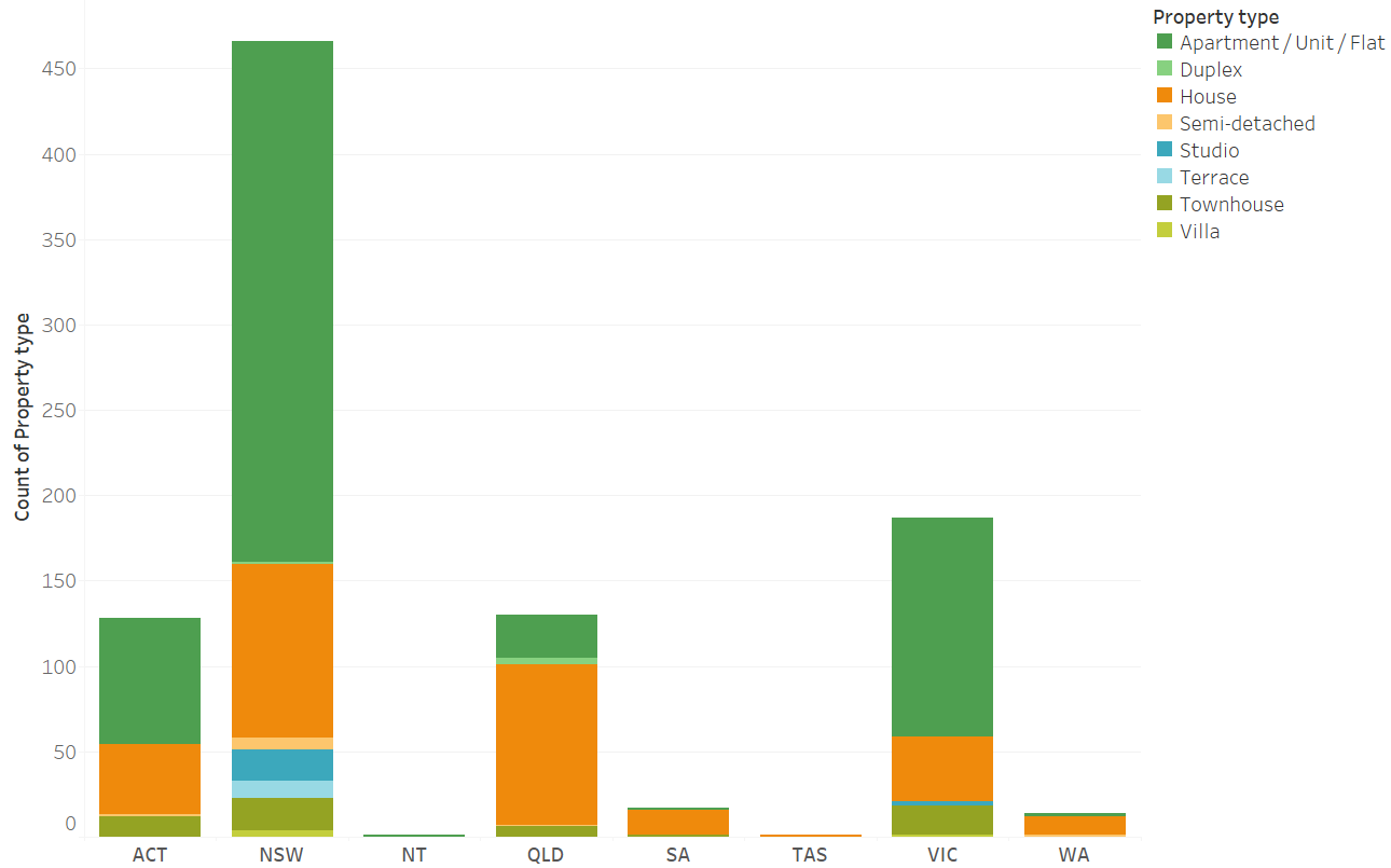
Stacked bar chart
-
Line chart
-
Area chart
-
Pie chart
-
Doughnut chart
-
Stacked bar chart
-
Scatter plot
-
Histogram
-
Box plot
-
Violin plot
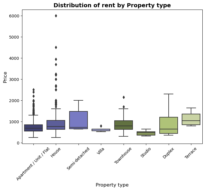
Choosing the right graph is crucial because it can transform data from numbers to valuable insights. When selecting a visualisation, always prioritize clarity, accuracy, and storytelling.
Next time when you are about to create a chart, take a moment to ask:
